How I choose Colours

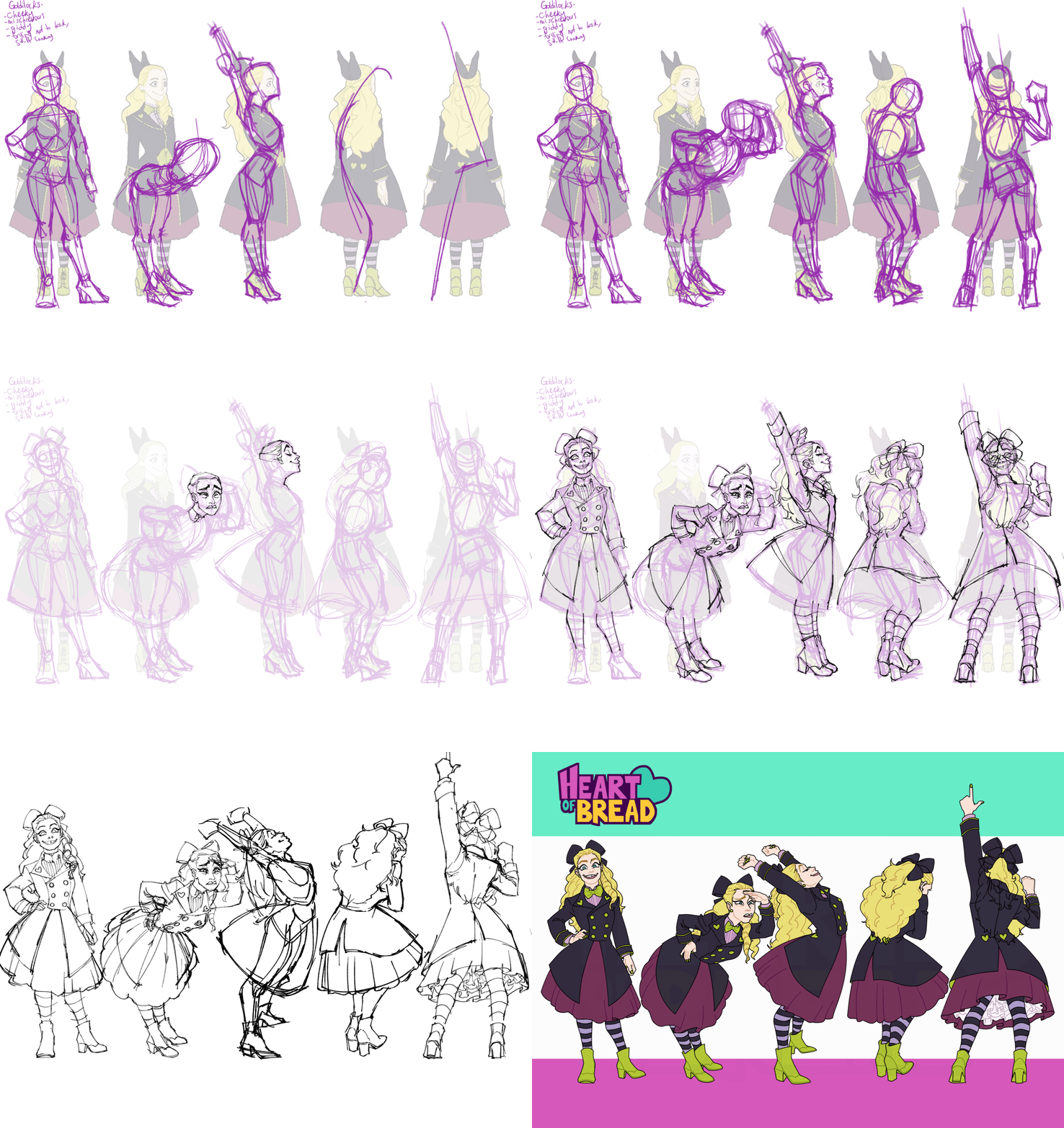
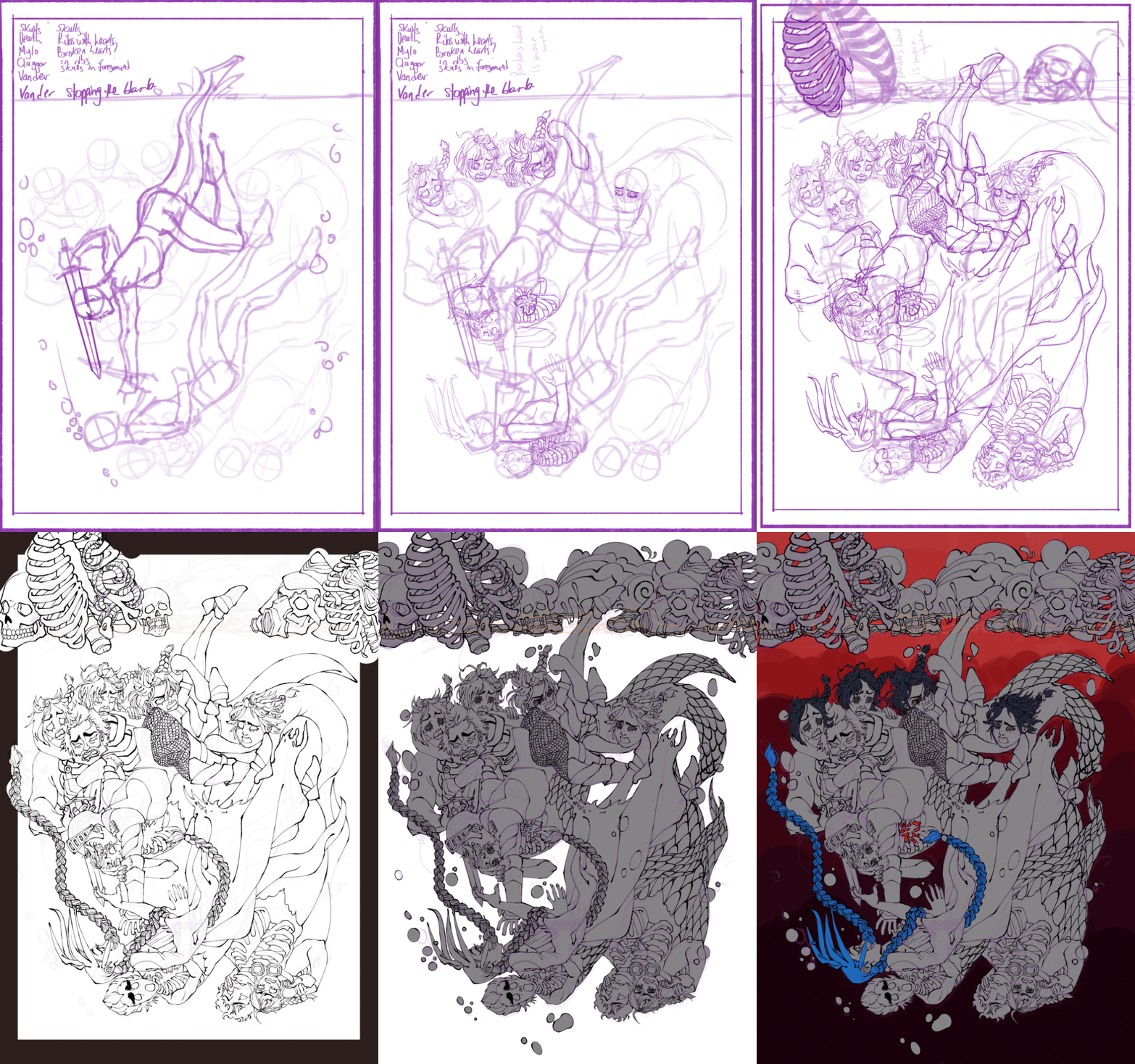
A little example summary of my process when picking the final colour palette and colour distribution for my pieces, whether non polished concept art or illustration.

I wanted a summer-y/spring-like feeling, to compliment the big sunhat and drink in hand, as well as adding a playful contrast to the dark eyeball boba.
There’s obviously a lot more that goes into choosing the right colours in design; intended mood, graphic design elements, etc. Every project and piece has its own requirements.
Everything starts with an imperfect thought, and we create until we end up with an imperfect but successful result!

It’s all about value!
I used to struggle with colours a lot, but wanted to get better and textbooks were my friend. Colours that seems discordant can work together with as long as they’re chosen with intention and with good control of value. If I want a simple unified palette, I would colour in the drawing in grayscale, choosing 5 specific values, then experiment with a grayscale filter on all the prospective palettes, making sure that there’s a matching value with my piece.
After that, it’s just trial and error, which can also be one of the most fun parts. The method to improving in art I’ve found over the years, is learning to love the process.


